Hello everyone, Jarell Pryor here!
I’m the Environment Artist on Attunement: Power of the Gods.
Here’s a brief overview of our design process behind the aesthetic of the map Cliffside.
The Start
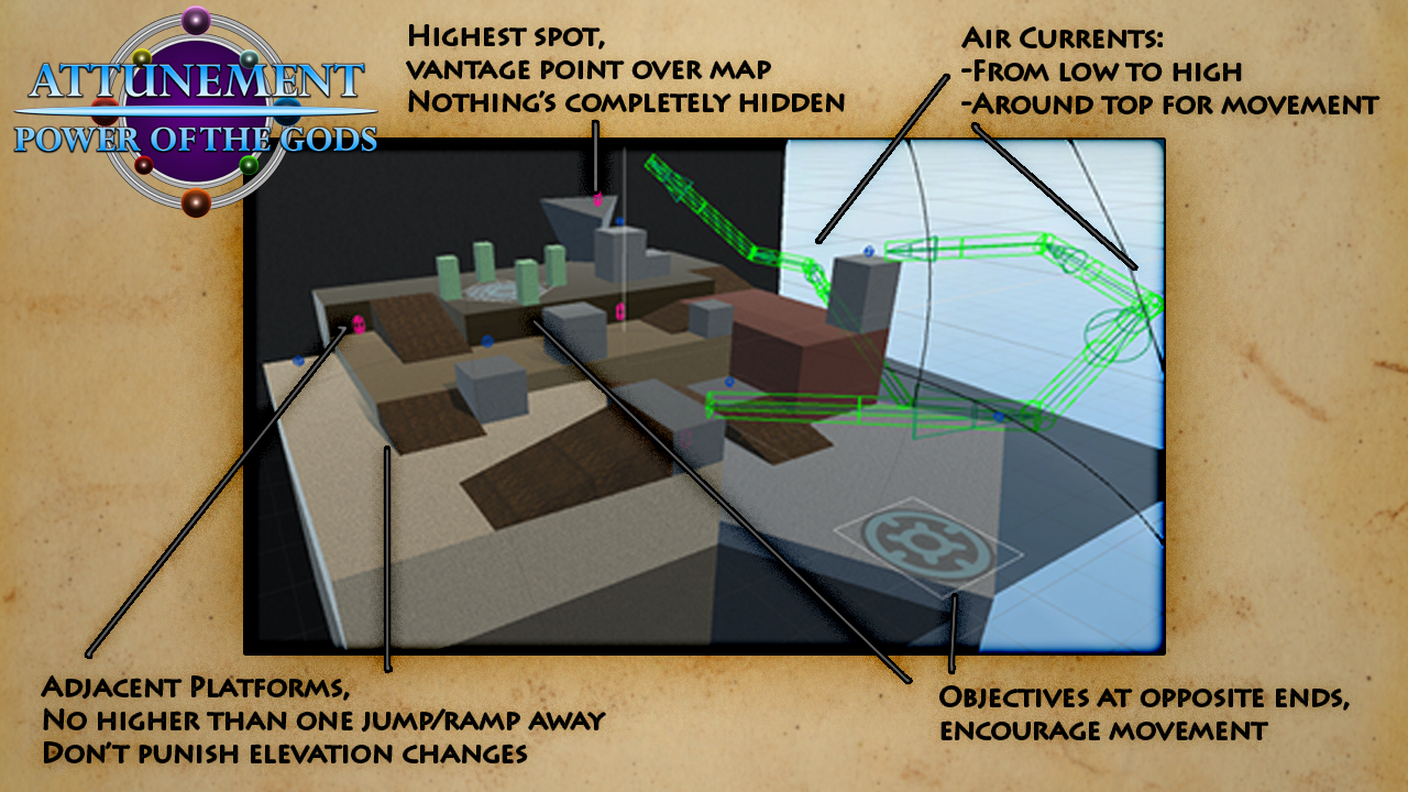
I was tasked with developing the overall visual concept and details for this level prototype that I was given. Palmer and I playtested the prototype map multiple times to make sure design goals were thoroughly conveyed and mutually understood. With this information, I then compiled those key design goals into an image for myself, and began to concept the map with them in mind.
Concepting
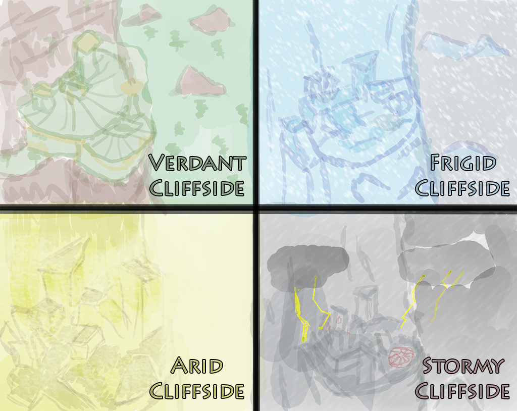
Before we settled on the elemental theming of the environment, I played around with some potential possibilities based on the prototype level. Here you can see the four rough concepts. One was the thought of a possible structure built into the cliffside itself, embellished with lush greens and earthen browns. Another was a frigid ice environment surrounded by frozen mountains during a snowstorm. Third was an arid earthy design, a product of human carving into the dry rock. Lastly, a jaggy stone cliff during an ominous thunderstorm. Of the many possibilities, we decided to highlight the elements of earth and air primarily, and I therefore went with the arid earthen cliffside concept.
Reference
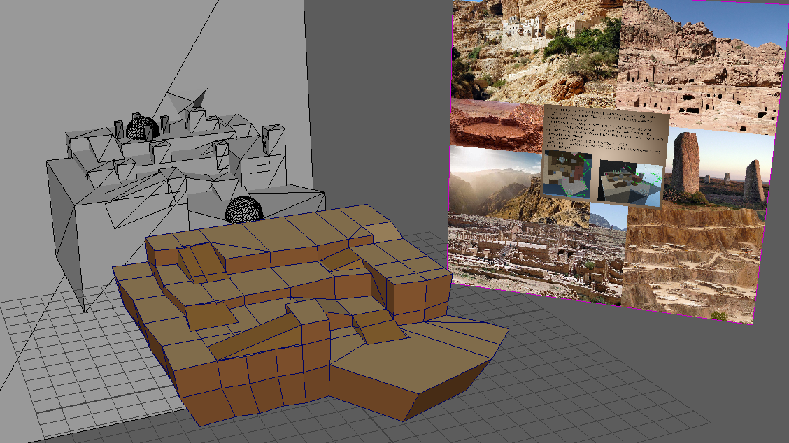
As most artists will say, research is arguably the most important part of the design process. And while it is very useful to look at other representations of this type of environment in the medium at hand, the way to produce more unique and faithful work is by looking at real-world reference. I compiled an image of different earthen constructs, carvings, and natural forms to guide my design. Even using it as an image plane within the Maya viewport to guide me as I modeled.
Drawing
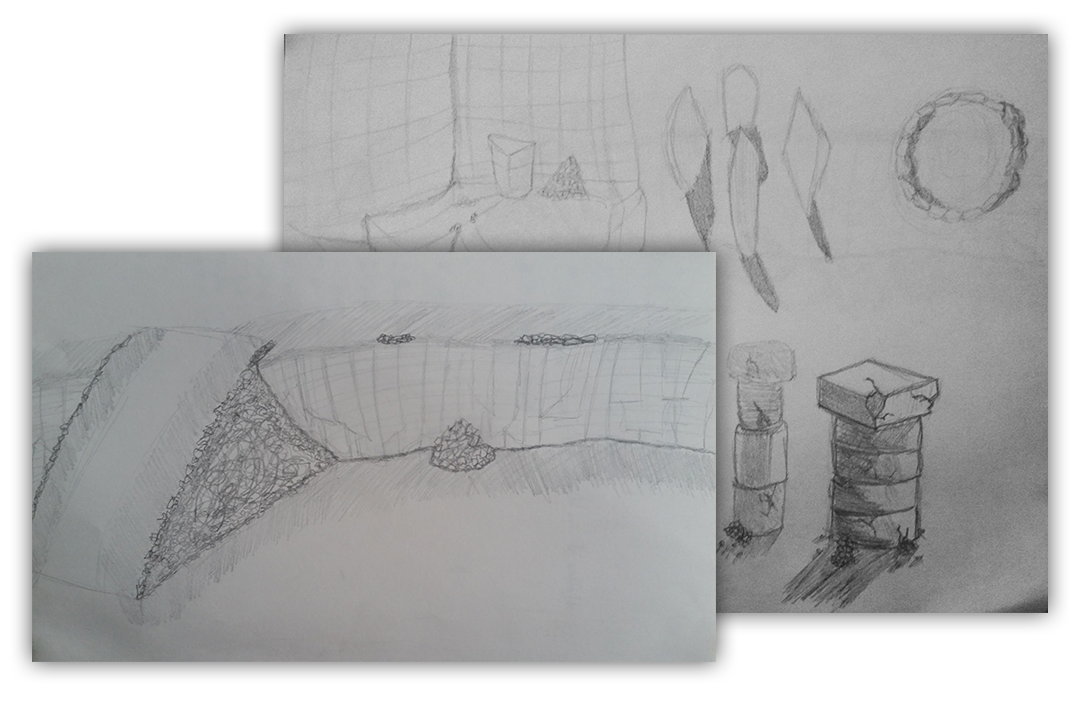
Having looked at and compiled a sufficient amount of reference material, I began to plan the environment out with pencil-and-paper. Here is an example of some key elements I was interested in including. In certain modes, the gameplay requires objective locations established within the map, which I felt could be portrayed as man-made sites surrounded by placed rocks. With one of the locations being designated by four large standing stones, and the other being surrounded by smaller rocks cobbled together- a la False Kiva in Utah. I had also drew out an image to understand the different textures I would need to create for the map. Because of the thought that this environment was carved out, I based the texture differentiation on that of a rock quarry. Flat sandy floors, raw rocky vertical sections, and dusty stone particle filled corners.
Results
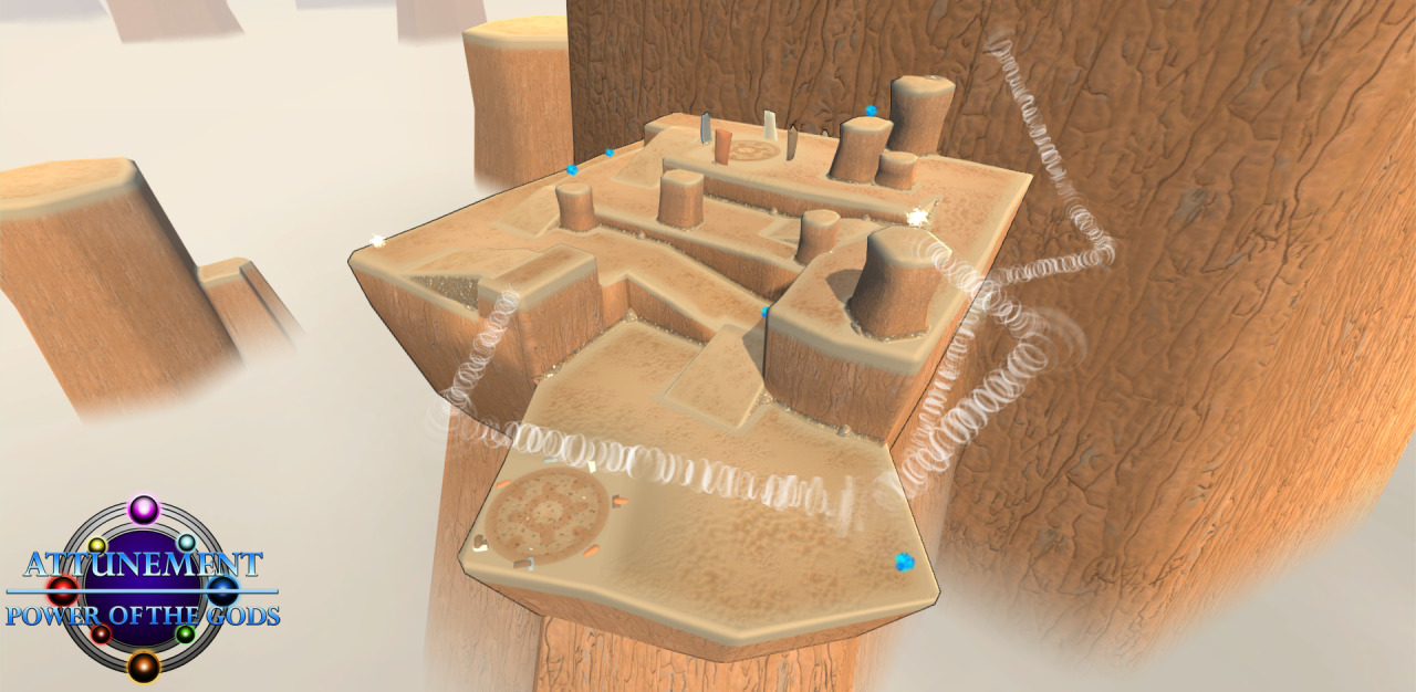
A week and a half – and lots of modeling, lighting, texturing, asset placement, and skybox creation – later, we have a complete environment in which players can combat one another to earn the favor of the gods. We worked hard to develop a strong pipeline for bringing the playtested level design together with an effective visual style in a manner that allows for flexibility based on player and team feedback. With this process, we are able to iterate upon ideas early on (e.g., the cobbled circle objective location becoming a ring of small rocks based on our priority for player traversal), rather than scrapping content we find to be ineffective only after it has already been completed.
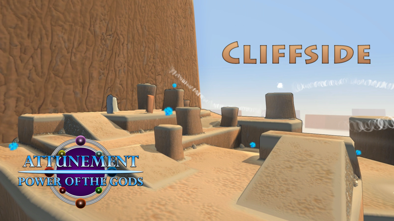
The map Cliffside is quickly shaping up to be the most chosen map in the game so far because of its wide open nature and many short elevation changes. The aesthetic we developed aims to give support towards, not distract from, the fast-paced multiplayer action of Attunement: Power of the Gods, and it seems that we succeeded.