Hello everyone, Palmer here,
So two of us (Dillon & Palmer) spent the last week down in California at GDC!
For me, it involved showcasing the game at the 4th annual GDC Playtest and Prototype Night.
GDC
I did get the opportunity to talk to several game publishers and learn more about that process. I’m not seeking publishing for Attunement yet, but I want to be prepared if we take that route.
Prototype Night & Player Feedback
The Prototype Night went well and allowed Palmer to further evaluate the improved gameplay & playable menu UX (compared to the old terrible 2D main menu)
Here’s a general collection of takeaways:
- Thematic & sources of inspiration spark initial interest (Avatar: TLA, Super Smash Bros).
- The environment visuals & stage visuals spark positive initial interest.
- Diversity of gameplay styles are strongly represented.
- Void Zone is overpowered. It disrupts plans too effectively.
General UX Feedback:
- Level Selection and Match Starting aren’t very clear.
- The linked nature of A [Jump] and B [Primary offense] is not well conveyed in the UI
- Mana feels like a poorly communicated restriction on activity
- Charges & hotkeys aren’t immediately connected with individual abilities.
- Players didn’t quickly stumble on the Loadout Builder
- Loadout Builder is great and lets people pick quickly.
- Crimson Tower still creates poor play patterns. It needs another redesign.
- Players don’t know if their abilities are connecting / if they are succeeding in their objectives of damaging another player.
- Ability diversity is causing some analysis paralysis in new players
- Request for a lock-on button
Balance Changes
Void Zone
This ability is continually the above the power/utility/usability curve.
I haven’t wanted to nerf it’s homing gameplay because then it becomes too difficult to effectively use.
The nerf I’m applying is to have the zone lose more duration while a player is within it. This reduces the maximum punishment for when it is used optimally, without nerfing suboptimal usage. This allows it to still chase players but not be as disruptive or painful when it catches them.
Geyser
Geyser continued to under-perform in the limited tests I enable it for.
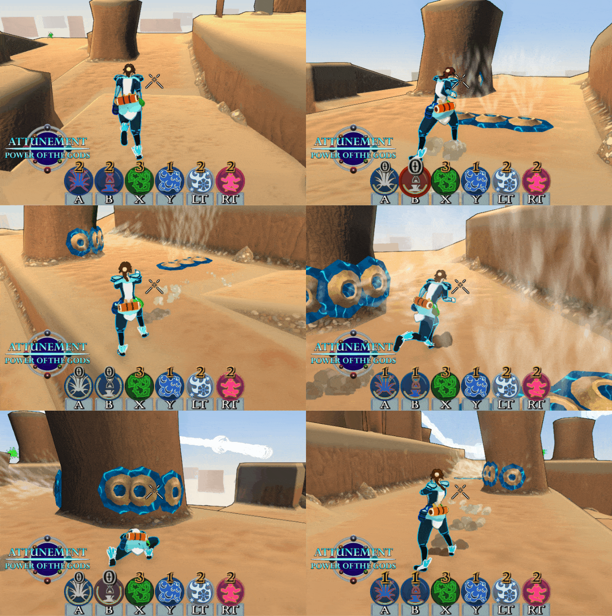
As a result I’m improving the offensive mine-laying mode. It now lays three times the mines in a line.
Look at how quickly I can set up a dangerous gauntlet of traps.
Overall, the resultant play pattern should give a hydroshaper more zone control and accessibility to reliable damage.
Mana
An ongoing UI fault has been the inability to meaningfully display mana costs for abilities. In the geyser gif above, you don’t know how much Bramble costs compared to Water Shield or Arctic Winds (the hidden health/mana globes don’t contain that information.
Overall this creates poor usability and will be addressed. The most immediate attempt will be testing a purely ‘abilities with charges’ version of the game. This means no mana limitations & no mana tokens on the maps. It will likely result in slightly increased recharge periods for non-primary abilities.
Improving Player UI
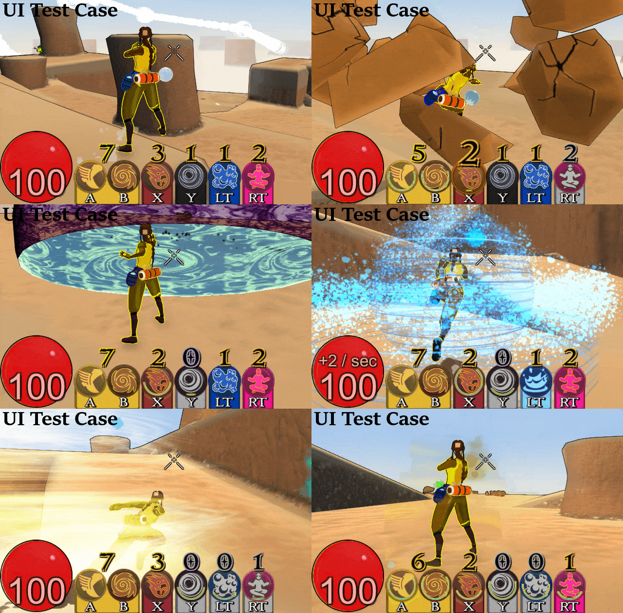
This UI test case features changes to improve clarity of UI.
- Charge indicators are much larger and more noticeable
- Hotkey backplate is now colored. It even changes color to indicate new modal action (X – Rock Smash, LT – Water Shield)
- A and B hotkey & charge indicators are connected, further indicating the connected nature of the abilities.
- Removal of mana allows players to understand ‘Charges are the resource’
- There are slight other limitations on usage (Meditate can’t be used while airborne), but I aim to make these cases rare.
Only downside: Updating the UI outdates many gifs, but future animation changes will do that already.
Ritehaven UX Improvements
Ritehaven has two major improvements coming:
- Better level selection approach
- More direct introduction to the Loadout Builder
It will take prototyping to find which are the best ways to address these issues, but I have some approaches in mind.
Game Feel
I’ve been putting decent effort towards making the game feel polished in a number of regions. This topic is typically known as game feel.
Hit Feedback
As mentioned in the GDC section, a common piece of UX feedback is that players don’t always know if abilities are connecting.
To address this I added some definition for assigning prefabs to different abilities which is their ‘hit effect’. Different abilities will use different hit effects.
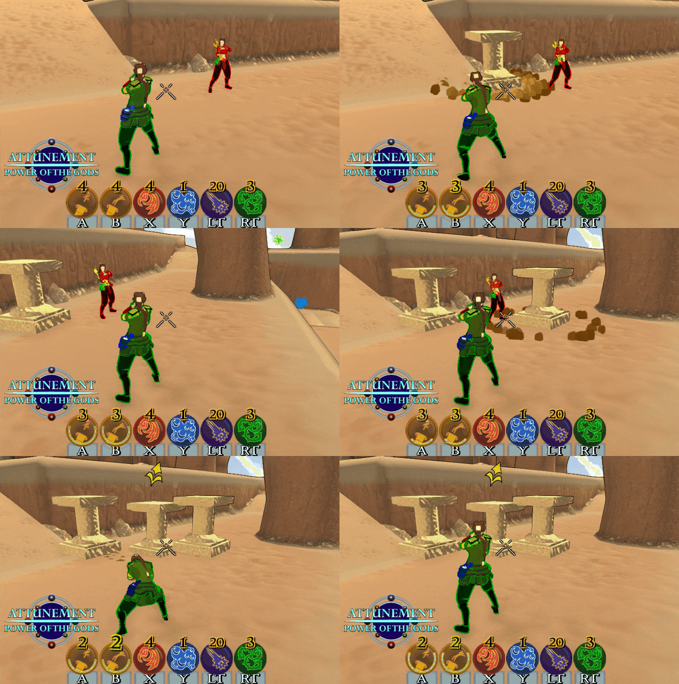
Comparison (demonstrated with Sand Sculpt)
Notice those nice SFX which pointedly say ‘Player Hit!’
Not the only change I plan to make, but this serves as a low hanging fruit. The next batch of changes would likely be small degrees of screen shake or player knockback hang time.
Gravity Improvements
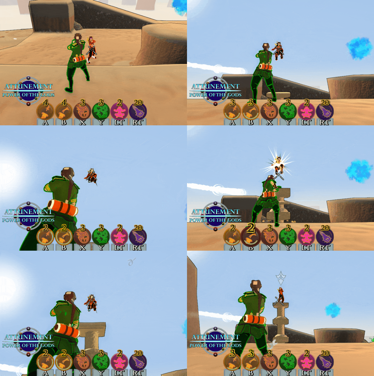
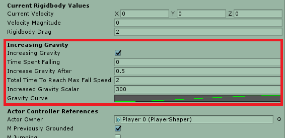
Due to the way drag & movement works in Attunement, characters felt very floaty. This was very much intended, but it Rigidbody drag unfortunately made gravity not feel like an accelerating force. I added a curve of increasing gravity for characters who are not actively rising in position (or flying).
End result, characters still feel floaty while ascending, but they regain their sense of weight as they continue through their falling arc.
Everything Else
Lockon Button: Maybe. Might build this feature to further assist in the targeting department.
Analysis Paralysis: This will likely be better in Gauntlet mode. The jury is out on the best way to address this problem. Perhaps a smart kit builder which gives more limited choices of ‘Now lets pick a damage ability’
Crimson Tower: This is by far the prettiest map, but the gameplay it creates isn’t ideal. I might just need to make the tower larger to increase the play area.
In Closing
GDC was great. Got plenty of interest when showing off the website, my business cards, or the game.
Going to keep plugging along and building the game!
Going to be testing the manaless mode at Pacific Science Center March 27th at 6 PM. Might even get a few eyes from people who work on Destiny looking at the game!
Thanks for reading!
